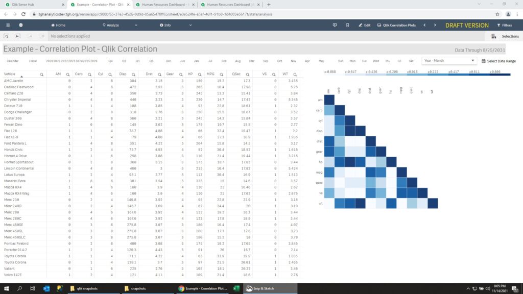
Correlation Chart in Qlik Sense
Qlik Sense does not have a correlation chart built-in. However we can mimic the capability by using a heat map.
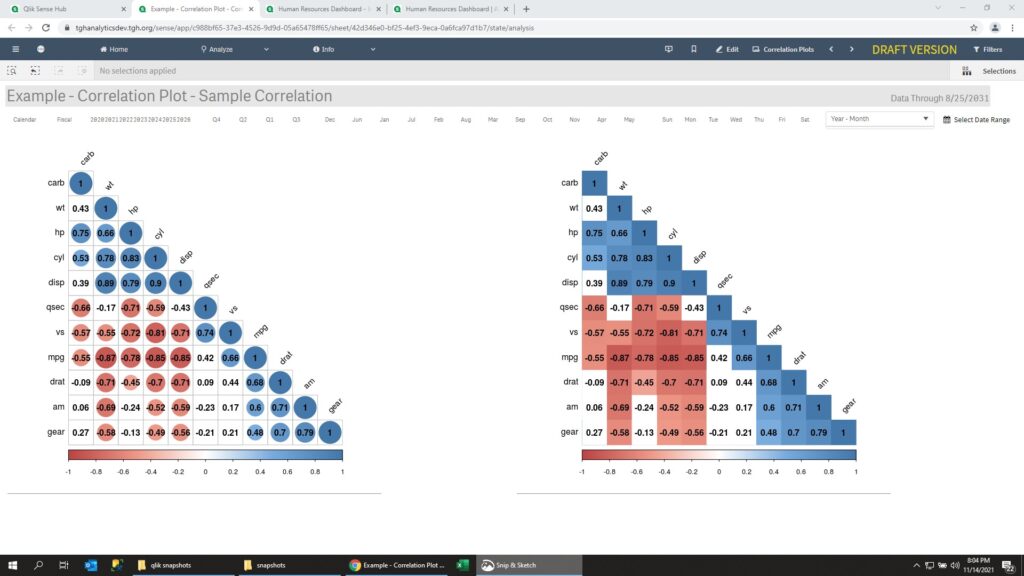
Correlation Chart – Sample 1
The first sample shows the MT cars dataset with values inside the chart.
Correlation Chart – Sample 2
Shows a pivot table of the data, and the heat map with darker colours representing higher correlation.
Leave a Reply