Dashboard – Service Line
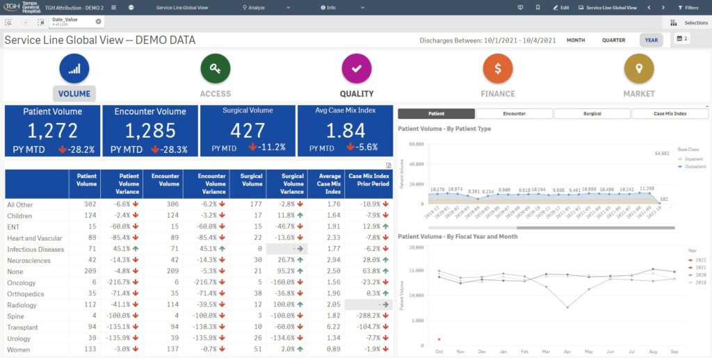
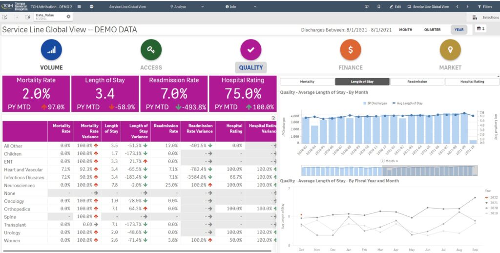
Dashboard showing summary statistics by Hospital’s different Service Lines. Showing statistics about number of patients, number of encounters, surgical volume, and case mix.
Visualizations in Tableau, Microstrategy
Dashboard showing summary statistics by Hospital’s different Service Lines. Showing statistics about number of patients, number of encounters, surgical volume, and case mix.
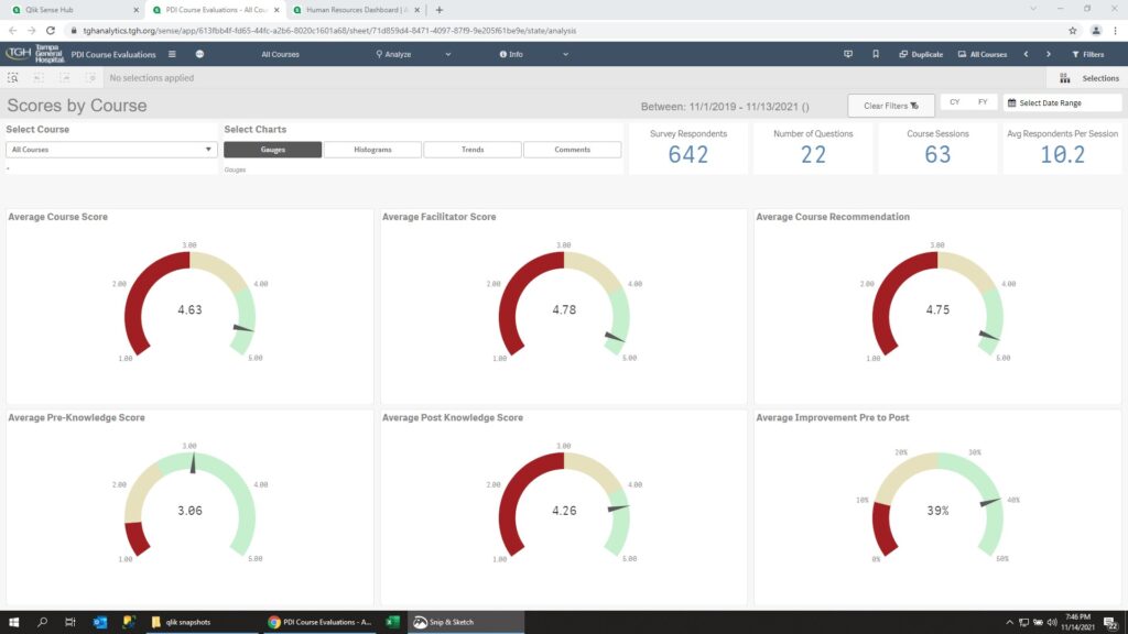
Dashboard tracking students responses to organizational learning sessions. Students would rate the course, instructor, self-evaluations, and provide free-form comments.
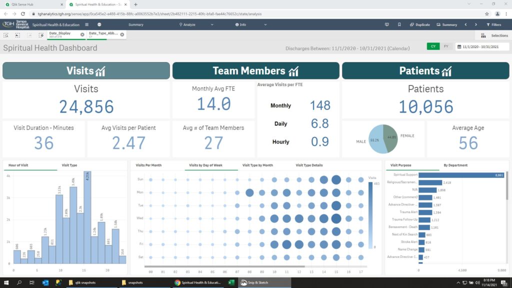
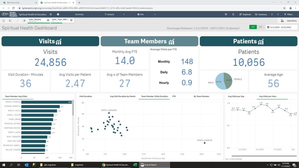
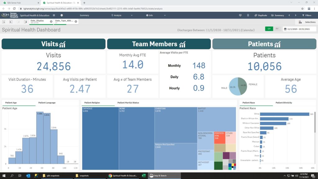
Dashboard tracking the contacts between spiritual advisors and patients. Spiritual advisors can be for a specific religious denomination or non-denominational. The dashboard was used to ensure the hospital was in compliance with anti-discrimination laws.
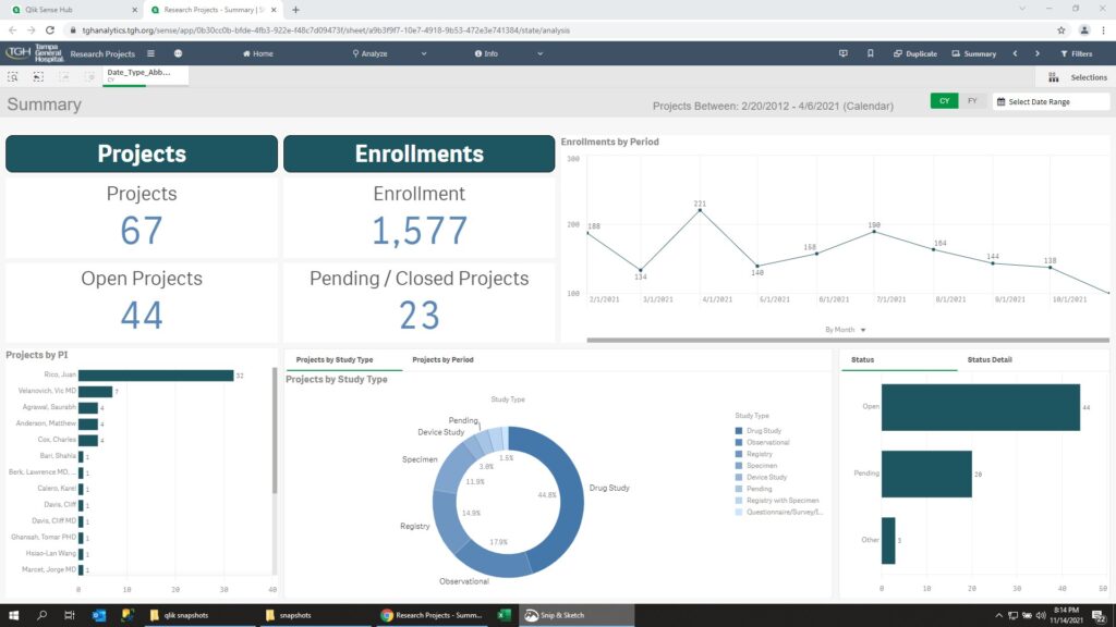
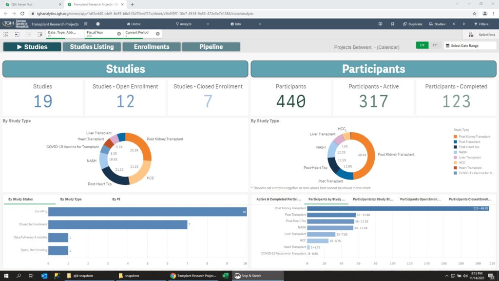
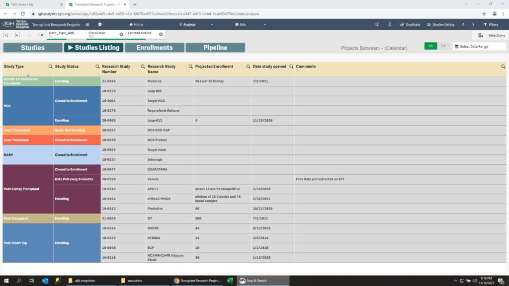
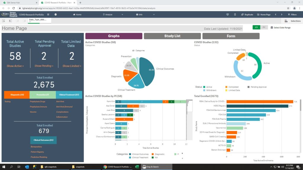
Tracking research studies at the hospital by type of study and number of participants in the study.
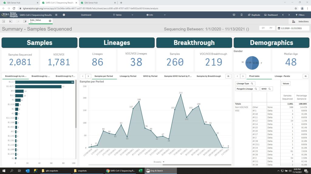
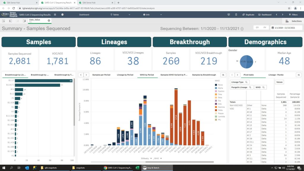
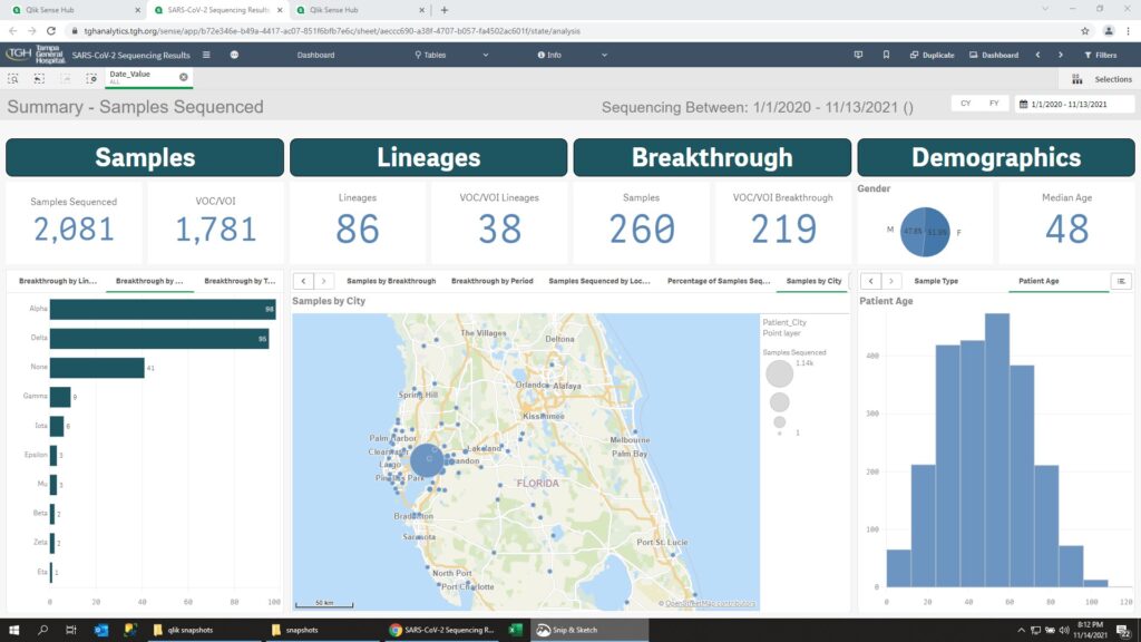
Tracking the Covid variant by incidents, lineage, location and patent demographics
Tracking the hospital’s different Covid Studies, by provider, area of interest, and funding source.
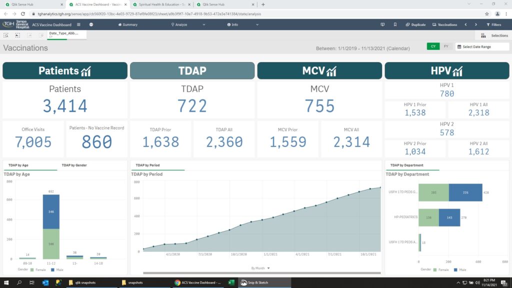
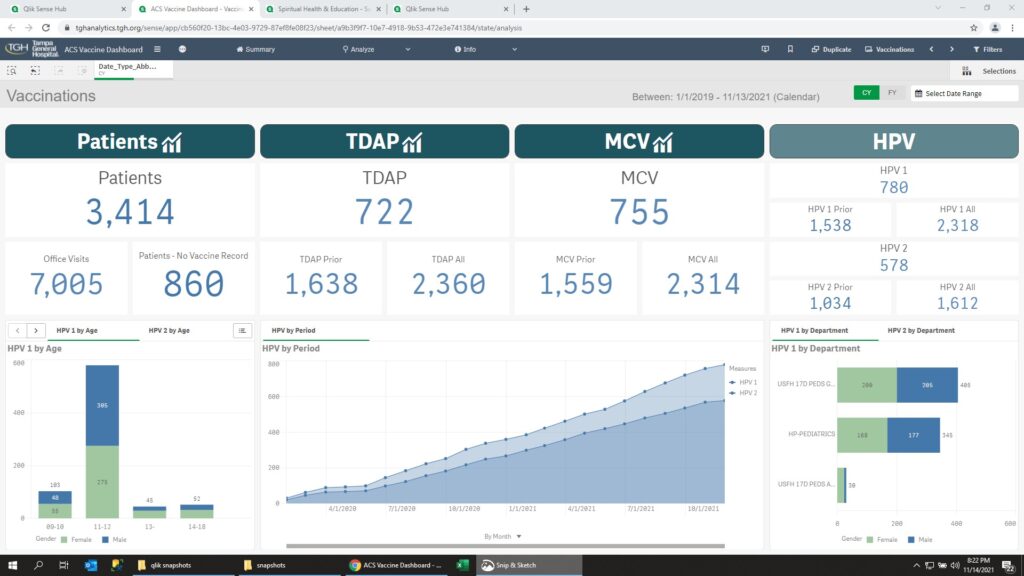
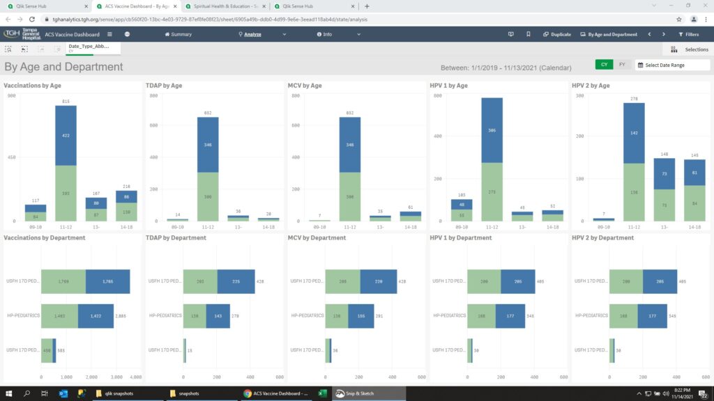
Dashboard showing details about vaccinations for children age 9 – 18
With focus on vaccinations for TDAP, MCV, and HPV.
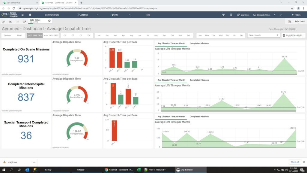
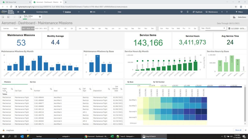
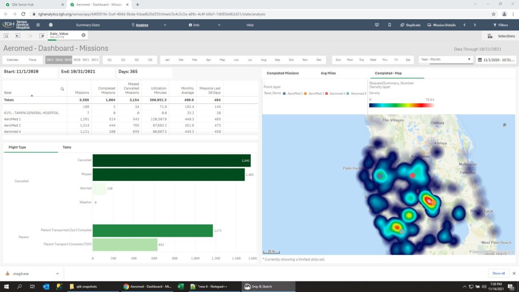
Dashboard reviewing the performance of the hospital’s four aeromed units. Aeromed units are used when a patient needs critical care and must be transported by helicopter and can not be transported by ground transportation.
Dashboard shows details about completed, cancelled, and maintenance missions.
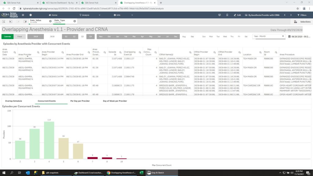
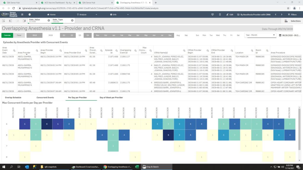
Show when an Anesthesiologist has an overlapping operation. Show the details on how many operations are overlapping, And the date and times of the overlapping operations.
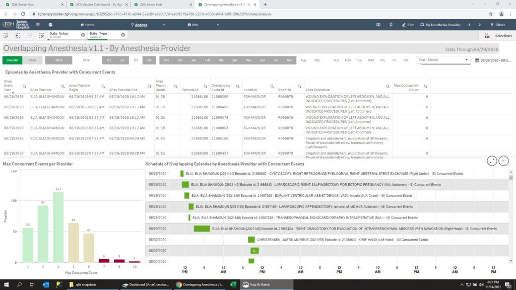
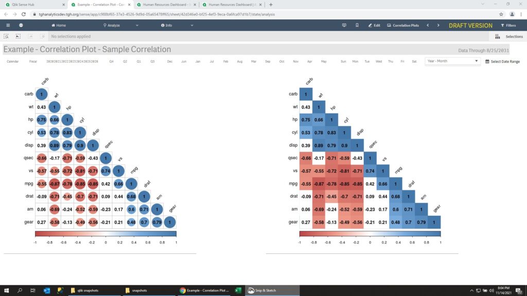
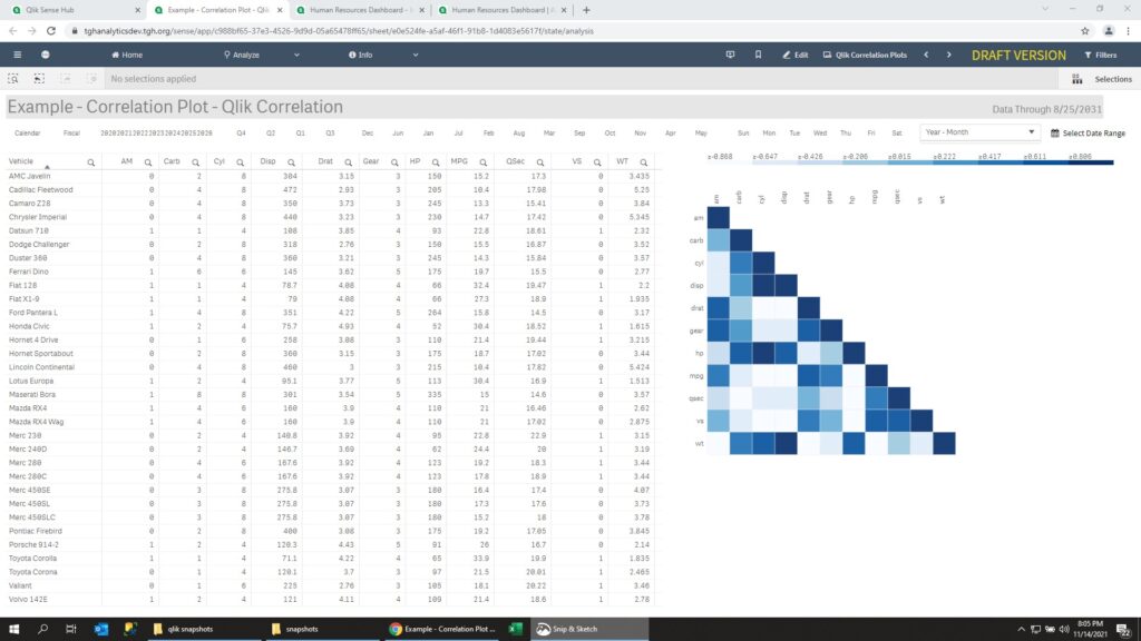
Qlik Sense does not have a correlation chart built-in. However we can mimic the capability by using a heat map.
Powered by WordPress & Theme by Anders Norén